Executive Dashboard & Membership Report Design
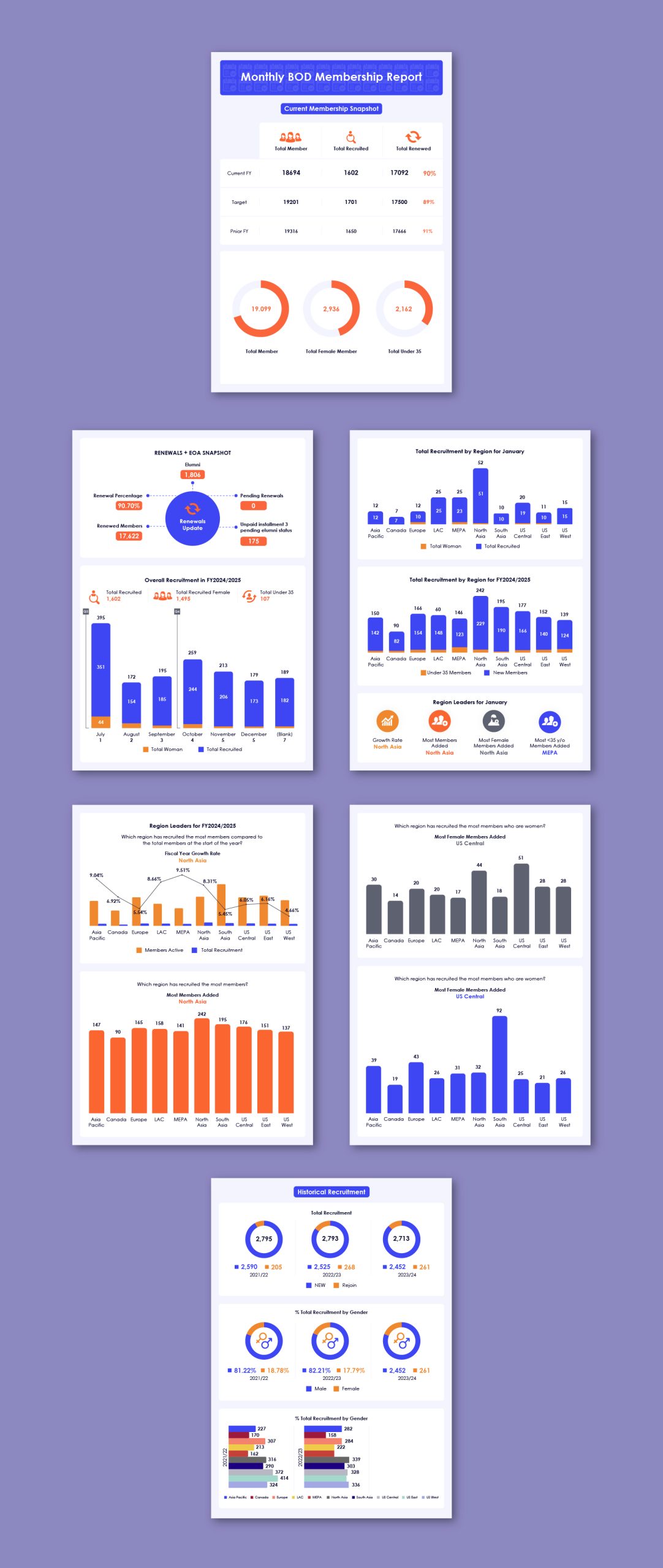
A clean and data-driven executive dashboard designed to present membership performance, recruitment trends, regional insights, and historical data in a clear and accessible format.
The report combines structured dashboards, bar charts, donut charts, KPI highlights, and comparative data visualizations with a refined blue, orange, and white colour palette. Each page is carefully organized to make large volumes of data easy to scan, compare, and understand.
The result is a professional reporting format that transforms complex membership data into a visually engaging executive-level report for analysis, presentations, and decision-making.